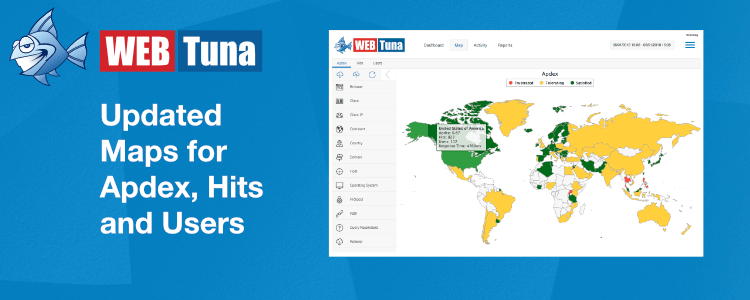
New and Improved WebTuna Map Screen
Today we released an updated Map screen with new functionality. We think you will love it. It has a cleaner style and you can now filter what is displayed on the map. We have new visualisations showing your site’s usage and performance as well as additional information available in the tooltips.
Summary of changes
- Visually cleaner look and feel.
- New filter panel.
- New tabs for Apdex, Hits and Users.
- More information in the tooltips.
Why change?
Previously the Map screen had icons overlaid on the map to represent both usage (page views) and performance (page load time). The problems with this is approach is that icons would sometimes be larger than the country they represented. Also, trying to represent 2 dimensions (usage and performance) with a single icon was not always that intuitive
What’s new?
Let’s look at the new features in a bit more detail.
1) New Visual Style
The Map has changed to use a different mapping provider with cleaner look and feel. The whole countries are now coloured in rather than icons overlaid on top of the countries.
2) More information
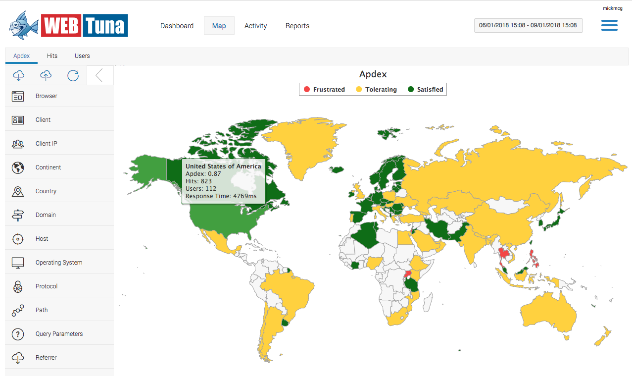
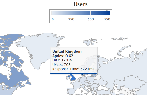
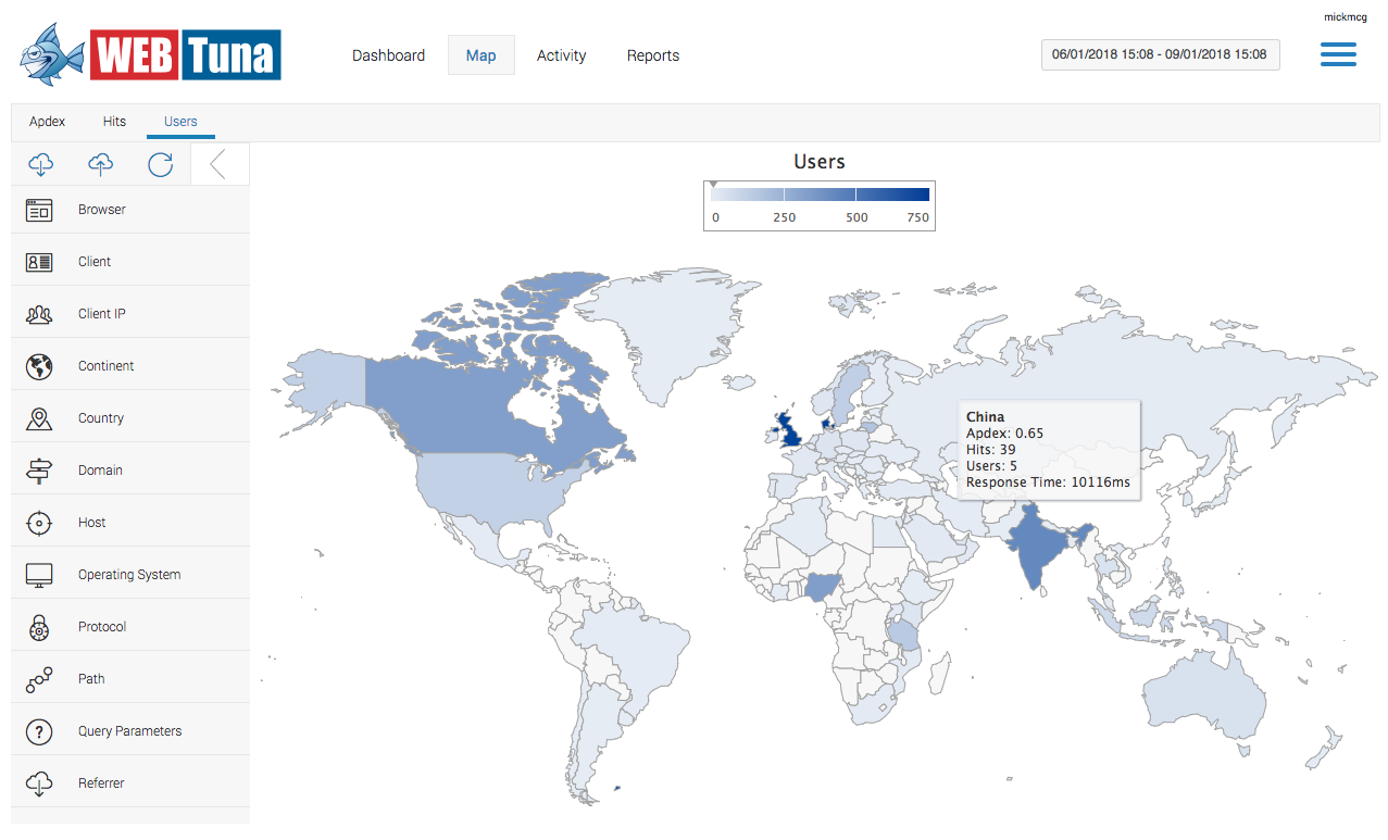
The tooltips previously showed just Number of Page Views and Page Load Time but now they include Number of Unique Users and Apdex score as well.
3) New Map tabs
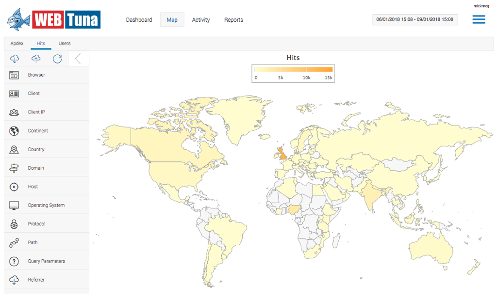
We now have not just 1 map but 3 different map views depending on whether you want to see performance (Apdex) or the number of Hits or Users. The Apdex tab shows countries coloured in either Red, Amber or Green based on whether their Apdex score for the country indicates that users were satisfied, tolerating or fustrated. For more on Apdex calculations see our previous article. The Hits tab and Users tab shows a gradient shaded map of the world with the more active countries darker and less active countries lighter in colour.
Note that number of Hits includes both page views and AJAX calls, as in the previous version of the map. As AJAX calls tend to be much quicker, they can distort the average figures. A good way to check this is to apply the ‘Type’ filter, using the filter panel.
4) New filter panel
You can now filter what gets displayed on the Map using the left side filter panel. This is the same filter panel that we previously introduced on the Dashboard screen. You can filter by browser, operating system, country, path, title or any of the 21 available filters.
Drill down
You can drill down from world view to continent view using the filter panel selecting the appropriate continent. From the continent view you can then drill down to an individual country by clicking within that country, or selecting from the filter panel.
Drill down within a country to the state or city level is currently not available but will appear in a future release. For now, drilling down on a country by clicking on it within the map, or selecting it from the filter panel, will zoom into the country but still only shows country level statistics. Clicking again on the icon lets you jump to the Activity screen to see the performance and usage for that country over time.
Let us know your feedback
We think you will love the new map but until we retire the old style map in 3 months, you do have the option to revert to the old (see link at the bottom). If you notice any bugs or have any feedback, please get in touch, we read and reply to every message.
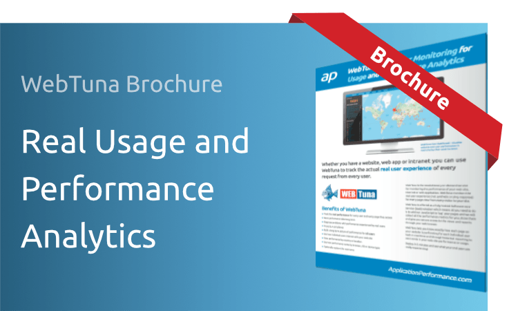
Download Brochure
WEBTUNA REAL USAGE AND PERFORMANCE ANALYTICS