
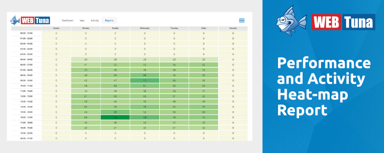
Performance and Activity Heatmap
How well do you know your way around WebTuna? In conversation with our customers we often hear them tell us, ”I didn’t know that you could do that in WebTuna".
That got us thinking. We bet there are a good number of features in WebTuna that you maybe saw once on a demonstration, a long time ago, and have now completely forgotten about. As a consequence, we thought we’d write a series of articles explaining some of the lesser-used areas of the product, and we will start with the Performance and Activity Heatmap.
This is found in the Reports section, and will give you 3 pictorial views of the overall performance and usage of your site, across the hours of the day and the days of the week.
One pitfall that some people have fallen into is in the date selection. Obviously, as it a whole, or multi-week view of your data, you need to be careful that the date selections represent a consistent time period. Although you may want to see the data for say, a week and a half, segmented across the week view, it would be quite difficult to interpret, and selecting whole-week periods is much more useful.
As in most of the reports, you have the Domain selector to give you a filtered view of either a single domain, a group of domains or all domains.
The report gives 3 views of your site usage and performance, summarising the time-period selected. The cells for each hour are coloured depending on the values.
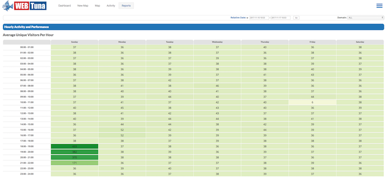
Average Unique Visitors Per Hour
This gives you an understanding of when your site is visited most often. The simple colour coding ranges from pale green for low usage, through to dark greens when you have many visitors. The actual number is displayed for each hourly time slot across the week.
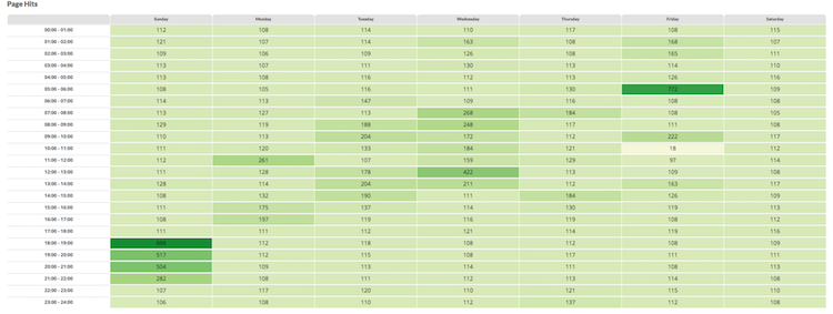
Page Hits
This gives you a very similar view, but this time, gives a representation of how busy those visitors actually were when they were on the site based on the total number of page views.
Average Response Time
This lets you see very quickly how the performance of your site, in milli-seconds, varied across the period. Colour coding is from greens through yellow to red as response time increases.
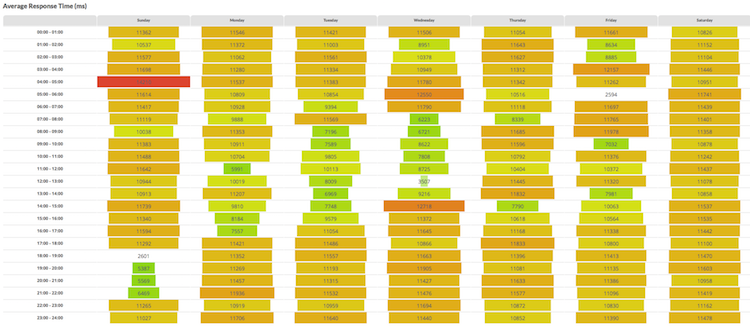
It is useful to correlate the three views, and notice as in the above screenshots, for example, that the slowest performance is not always when the site is busiest etc.
If you’ve never looked at this report, why not check it out occasionally – it gives a very quick overview of site performance, and you can get to it here. Or if you are new to WebTuna, please signup for a 15 day free trial.